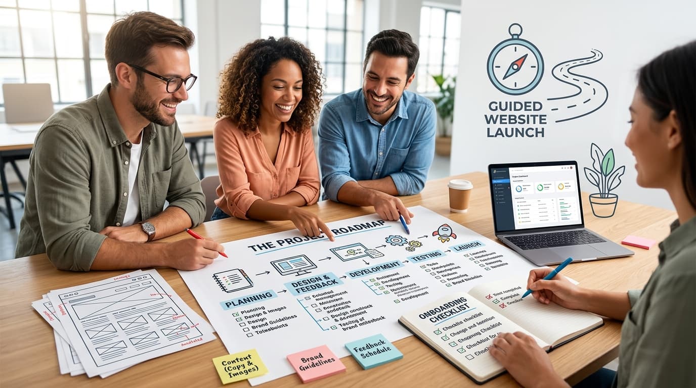
Build your website right—onboarding guide.

How This Guide Works
Welcome
Building a website with us is a partnership, not a drop-off. This guide is your roadmap—a plain-English walkthrough of what happens, when, and what we’ll need from you along the way. No jargon, no guesswork. Just follow along as we go, section by section, and you’ll always know exactly where things stand and what’s next on your plate.
Getting Started
Here’s the truth: building or upgrading a website can feel like a lot—especially if you’ve never done it before. There’s copy to write, images to find, decisions to make, and a whole vocabulary of terms nobody explained to you. We get it, and that’s exactly why this guide exists.
Think of it as your project companion. As we move through your build, we’ll send you a link straight to the relevant section here—so instead of a vague “please send your content” email, you’ll land on exactly the right page with a clear explanation of what’s needed and why it matters.
We’ve built websites for all kinds of Durban businesses, and if there’s one thing we’ve learned, it’s that projects move fastest when everyone knows their role. Our job is the technical build, the design, and the strategy. Your job is the stuff only you can provide—your story, your products, your voice. This guide bridges the two.
Work through it as we send you each section. Ask questions whenever you need to. And don’t worry about getting it “perfect”—we’ll refine things together as we go. Let’s build something you’re proud of.

Setting Your Project Goals
Before we touch a single design element, we need to know where we’re headed. Every strong website starts with clear goals—who it’s for, what it needs to achieve, and how you’ll know it’s working. Take a few minutes to think this through with us. It’s the foundation everything else gets built on.
Key Points
It’s tempting to jump straight to colours and layouts, but the websites that actually perform all start the same way: with clarity on what they’re meant to do. Here’s what’s worth thinking through before we get building.
Who is this for?
Get specific about your target audience—not just “small businesses” but the actual people who’ll land on your site. What are they searching for? What’s bothering them when they arrive? The more clearly you can picture them, the better we can design and write for them.
What’s the website’s job?
Every site needs one clear purpose. Is it there to generate leads, sell products directly, build your credibility, or support existing customers? Trying to do everything at once usually means doing nothing particularly well—so let’s nail down the main goal first.
How will you measure success?
Set yourself something concrete to track—more enquiries, more online sales, more time spent on key pages. It doesn’t need to be complicated, but having a number in mind means we can build with that outcome in view, and you’ll know if it’s working once we’re live.
What’s the content plan?
Your site’s content—the words, the images, the structure—needs to serve your audience and your purpose. We’ll guide you through gathering this (more on that in the next section), but it helps to start thinking now about what story you want your website to tell.
None of this needs to be perfect on day one. It just needs to be honest. The clearer you are with us up front,
the smoother—and faster—the rest of the build will go.

Getting Your Copy Together
The Words on the Pages
Your website’s words matter more than almost anything else on the page. Good copy is what turns a visitor into an enquiry—and it’s something only you can really provide. We’ll guide the structure, but your story, your language, and your offering need to come from you. Here’s what we’ll need and why it counts.
A key part of your website
m Good copy does more than fill space—it’s often the single biggest factor in whether your website actually works. It shapes how visitors experience your business, whether they trust you, and whether they take action. It also plays a real role in how well your site is found—search engines pay close attention to relevant, specific language, so the words you choose (including the terms your customers actually search for) matter more than most people realize.
To get this right, here’s what we’ll need from you:
A description of your product or service
— including key features and, importantly, the benefits to your customer.
Existing marketing materials
— brochures, ads, social posts, anything you’ve already used to describe your business.
Your target audience
— who they are, what they need, and what tends to convince them.
Branding guidelines
— your logo, colours, and tone of voice, if you have these documented.
A mission statement
— a short, clear line on what your business is about and why it exists.
Associations and certifications
— any industry bodies, compliance requirements, or credentials worth mentioning.
Terms and conditions, if applicable to your product or service.
A privacy policy to keep your site compliant.
Your contact details
—name, address, and phone number.
A quick note on that last one: consistency matters more than you’d think. Make sure your business name, address, and phone number (often called NAP) match exactly across your website, Google Business Profile, social media, and any directories you’re listed in.
Search engines use this consistency to confirm your business is legitimate, and where it says it is—inconsistent details can quietly hurt your visibility and even send potential customers to the wrong information.
You don’t need polished, ad-agency copy at this stage. Rough notes, voice memos, even a WhatsApp voice note talking through your business—we can work with all of it.
The important thing is getting your voice and knowledge onto paper (or into our inbox) so we can shape it into copy that sounds like you and works for your visitors.
Emailing Best Practice
A quick note on emailing us
One small habit makes a big difference to how smoothly your project runs: please start a new email for every new request, idea, or file you send us — rather than replying to an old thread.
Here’s why this matters: long reply-chains bury important details. A new logo file, a content change, or a question about your homepage can easily get lost in a thread that started three weeks ago about something else entirely. Separate emails with clear subject lines mean nothing gets missed, misfiled, or forgotten — by you or by us.
When you email us, please use a clear, specific subject line that describes exactly what’s inside — for example:
- “Homepage copy — final version”
- “Logo file for header”
- “Question about Product Page images”
Avoid vague subject lines like “Website stuff” or “Re: Re: Re: Hi” — these are the ones that get missed or lost.
This isn’t us being fussy for the sake of it — it genuinely keeps your project moving faster, and it means every request gets seen, actioned, and tracked properly. We appreciate you working with us on this.
Images for the Website
Section 4:
Photos do a lot of heavy lifting on a website—they’re often what visitors notice before they read a single word.
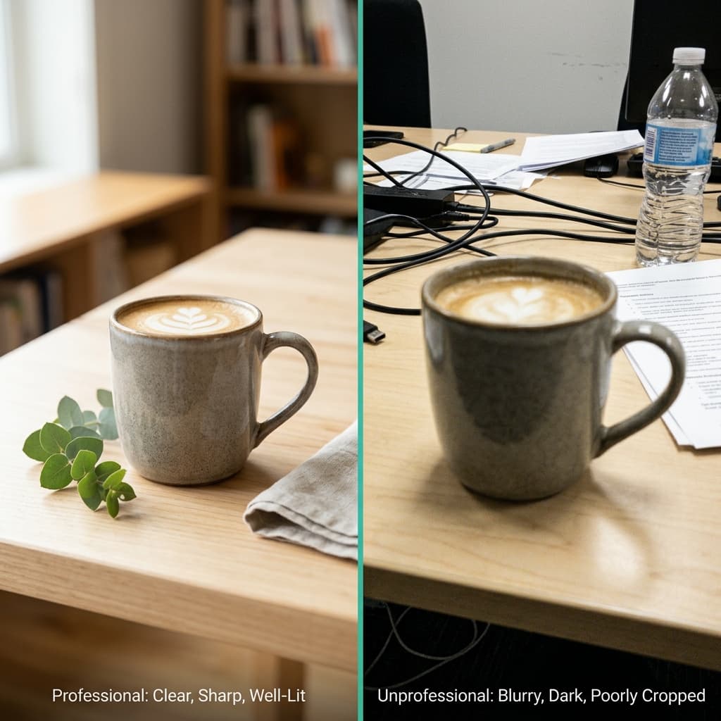
Good images build instant trust; poor ones (blurry, stretched, or obviously stock) do the opposite.
Here’s what we need from you and a few things worth avoiding.
Best Practice with Images
A website’s images say almost as much about your business as the words do. Grainy phone snaps or overly generic stock photos quietly signal, “This business didn’t put in the effort” — even if your product or service is excellent. The good news is you don’t need a professional photographer to get this right, just a bit of care.
What to send us:
- High-resolution photos of your products, your team, your premises, or your work in action—real photos beat stock every time for building trust.
- Clear file names
— Rename images before sending so we know what’s what (for example, “blue-widget-front.jpg” rather than “IMG_4213.jpg”). This saves a lot of back-and-forth.- Multiple angles or options
where relevant—for products especially, a few options per item gives us room to pick the strongest shot.- Your logo
in its original, high-quality format (ideally a transparent PNG or vector file, not a screenshot).A few things to avoid:
- Heavily filtered or over-edited images—natural lighting reads as more trustworthy than a heavily photoshopped look.
- Low-resolution images pulled from social media or WhatsApp—these often look pixelated once placed on a website.
- Images with text, watermarks, or logos already baked into them (from a previous designer, a stock site, or a social media template)—we need clean source files to work with.
A word on copyright:
Please only send us images you own the rights to use—either photos you’ve taken yourself, purchased stock images, or ones properly licensed for commercial use. Using an image found through a random Google search can land you (and us) in hot water if the copyright holder comes calling. If you don’t have suitable images for a particular section, let us know—we can source properly licensed stock photography on your behalf.Once we have your images, we’ll handle the technical side—resizing, compressing, and formatting them so your site loads quickly without sacrificing quality.

The Home Page
Section 5:
Your home page is your first impression—and on the web, first impressions happen in seconds.
Visitors decide almost instantly whether to stay or leave, so this page needs to work harder than any other.
Here’s what makes a home page actually convert and what we’ll need from you to build it right.
Best Practice for Home pages
Research consistently shows that visitors form an opinion about a website within moments of it loading — and that first impression heavily influences whether they stick around or bounce straight back to Google. Your home page carries more weight than any other page on your site, so it’s worth getting right.
The key components we’ll need your input on:
- A clear headline
—one sentence that tells visitors exactly what you do and who it’s for. Clever wordplay can wait; clarity comes first.
- A strong hero image or video
—the first visual a visitor sees, ideally showing your product, service, or team in action rather than generic stock imagery.
- A clear call to action
—what do you want a first-time visitor to do? Call you, request a quote, browse products, book a consultation? Pick one primary action and make it obvious.
- Supporting sections
—brief highlights of your key services or products, a short “why choose us” summary, and space for testimonials or trust signals (reviews, client logos, certifications).
- Navigation priorities
—which pages matter most to your visitors? We’ll use this to shape your menu so people find what they need without hunting for it.
A note on trust signals:
Visitors are naturally cautious with businesses they haven’t dealt with before. Genuine touches—real customer reviews, recognisable client logos, industry certifications, or even just a photo of your actual team—do far more to build confidence than polished corporate copy ever will.Think of your home page as a well-organised shop window: it doesn’t need to show everything, just enough to earn a click deeper into the site. We’ll handle the structure and design—we just need your headline direction, hero content, and a sense of what you most want visitors to do when they land.
Your home page checklist
Here’s a simple summary of what we’ll need from you for this section. No need to overthink it — rough notes are fine, we’ll refine everything together.
- One sentence about your business — what you do and who it’s for, in plain language.
- Your best photo or short video — the one image or clip you’d want a stranger to see first if they judged your business on it alone.
- The one thing you want visitors to do — call you, fill in a form, browse your products, or book something. Just pick one main action.
- A short list of your main services or products — just the highlights, we’ll expand on these elsewhere on the site.
- Anything that builds trust — customer reviews, well-known clients you’ve worked with, certifications, or awards.
- Your most important pages — tell us which 3–4 pages your visitors need to find easily, so we can set up your menu around them.
Your product pages
Section 6
Your product pages do the actual selling—this is where browsing turns into buying.
A strong product page answers every question a customer might have before they even ask it.
Here’s what makes a product page convert and what we’ll need from you to build one that works.
The key components we’ll need your input on:
- A clear product title
— specific and searchable (e.g., “Stainless Steel Insulated Water Bottle – 750 ml” rather than just “Water Bottle”). This helps customers and search engines alike understand exactly what they’re looking at. - High-quality images from multiple angles
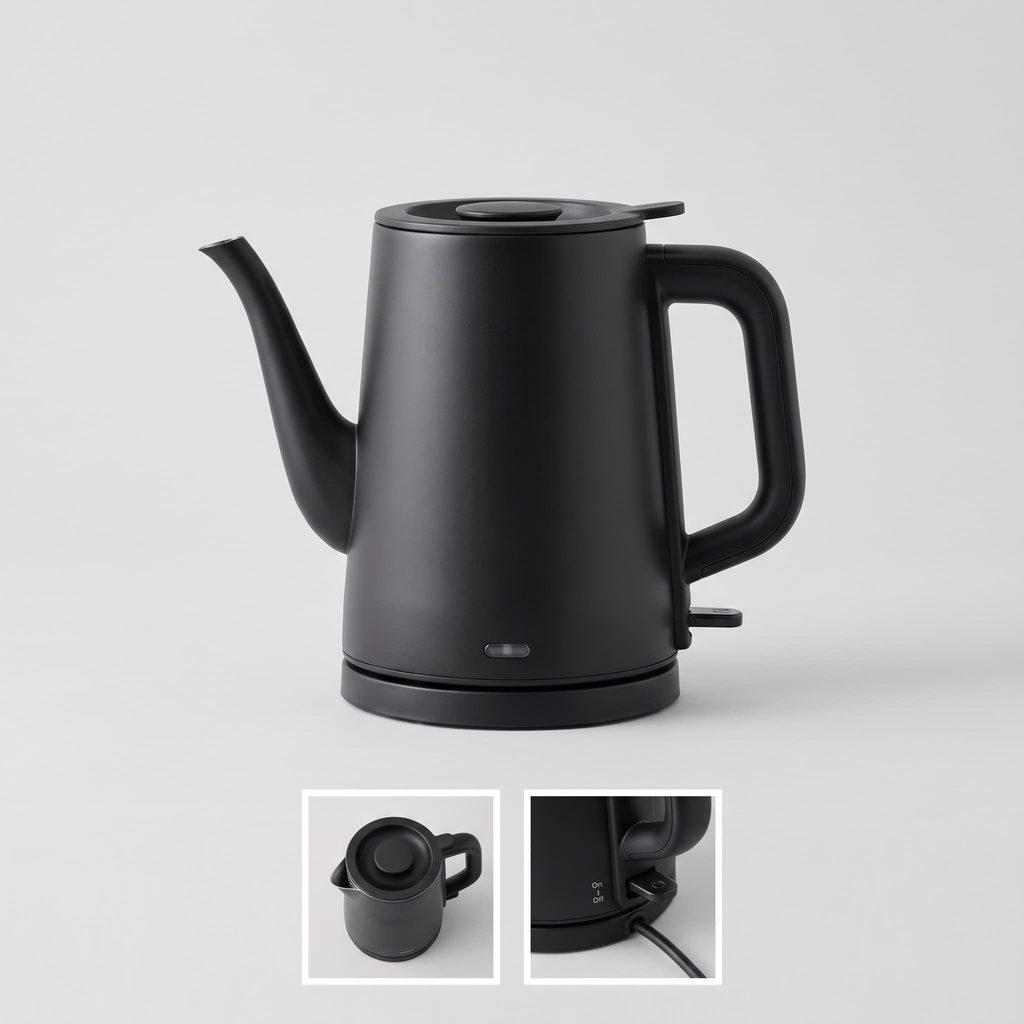
— front, back, in use, and close-up detail shots where relevant. If size or scale matters, a photo showing the product in context (next to a common object or in use) helps enormously. - A benefits-focused description
— Don’t just list what the product is; tell us what it does for the customer. “Keeps drinks cold for 24 hours” sells better than “double-walled vacuum insulation” on its own—though including both means you’re speaking to both practical buyers and detail-checkers. - Technical specifications
— dimensions, materials, weight, compatibility, or anything a customer would want confirmed before purchasing. This also cuts down on pre-sale questions later. - Reviews or social proof,
If you have them—even a couple of genuine customer quotes go a long way toward building buyer confidence. If you don’t have reviews yet, let us know and we can build a system to start collecting them.
A word on descriptions:
Resist the urge to make every product description a lengthy essay. Lead with the key benefit and the essentials, then let interested buyers dig into detail if they want to. Most visitors scan before they read—clear structure (short paragraphs, bullet points for specs) matters more than clever writing here.
If you’re supplying content for multiple products, a simple spreadsheet works well—one row per product, with columns for title, description, specs, and image filenames. It keeps things organized on both ends and speeds up the whole process considerably.

Header 2
Username stretchomundo
Password AGul(0VB4t)lTOlN
……………………………. >> PAYFASTserna……………………………………. >> GTEM
Username StretchMaster
Password 7MdiT#a7TlKk6r&OR1…………………………………….. >> DIGI STORE 24
Header 2
Username stretchomundo
Password AGul(0VB4t)lTOlN
……………………………. >> PAYFASTserna……………………………………. >> GTEM
Username StretchMaster
Password 7MdiT#a7TlKk6r&OR1…………………………………….. >> DIGI STORE 24
xx Header 3
xxxxx xxxxxx cxxxxxxxx Think of it as your project companion. As we move through your build, we’ll send you a link straight to the relevant section here — so instead of a vague “please send your content” email, you’ll land on exactly the right page with a clear explanation of what’s needed and why it matters.
We’ve built websites for all kinds of Durban businesses, and if there’s one thing we’ve learned, it’s that projects move fastest when everyone knows their role. Our job is the technical build, the design, and the strategy. Your job is the stuff only you can provide — your story, your products, your voice. This guide bridges the two.
Header 2
Username stretchomundo
Password AGul(0VB4t)lTOlN
……………………………. >> PAYFASTserna……………………………………. >> GTEM
Username StretchMaster
Password 7MdiT#a7TlKk6r&OR1…………………………………….. >> DIGI STORE 24
Header 2
Username stretchomundo
Password AGul(0VB4t)lTOlN
……………………………. >> PAYFASTserna……………………………………. >> GTEM
Username StretchMaster
Password 7MdiT#a7TlKk6r&OR1…………………………………….. >> DIGI STORE 24
xx Header 3
xxxxx xxxxxx cxxxxxxxx Think of it as your project companion. As we move through your build, we’ll send you a link straight to the relevant section here — so instead of a vague “please send your content” email, you’ll land on exactly the right page with a clear explanation of what’s needed and why it matters.
We’ve built websites for all kinds of Durban businesses, and if there’s one thing we’ve learned, it’s that projects move fastest when everyone knows their role. Our job is the technical build, the design, and the strategy. Your job is the stuff only you can provide — your story, your products, your voice. This guide bridges the two.
Header 2
Username stretchomundo
Password AGul(0VB4t)lTOlN
……………………………. >> PAYFASTserna……………………………………. >> GTEM
Username StretchMaster
Password 7MdiT#a7TlKk6r&OR1…………………………………….. >> DIGI STORE 24
Header 2
Username stretchomundo
Password AGul(0VB4t)lTOlN
……………………………. >> PAYFASTserna……………………………………. >> GTEM
Username StretchMaster
Password 7MdiT#a7TlKk6r&OR1…………………………………….. >> DIGI STORE 24
xx Header 3
xxxxx xxxxxx cxxxxxxxx Think of it as your project companion. As we move through your build, we’ll send you a link straight to the relevant section here — so instead of a vague “please send your content” email, you’ll land on exactly the right page with a clear explanation of what’s needed and why it matters.
We’ve built websites for all kinds of Durban businesses, and if there’s one thing we’ve learned, it’s that projects move fastest when everyone knows their role. Our job is the technical build, the design, and the strategy. Your job is the stuff only you can provide — your story, your products, your voice. This guide bridges the two.
HOME Page
When building a business website, the home page is one of the most important pages. It is the first thing visitors see when they come to your site, and it needs to make a great first impression. The key components for the home page, excluding the header and footer, are:

Hero section:
This is the first thing visitors see when they arrive on your home page. It typically includes a large image or video.
Value proposition:
This is a brief statement that explains what your business does and why it’s unique. It should be easy to understand and communicate the benefits of your product or service.
CTA
A clear call to action that encourages visitors to take action.
Features/Benefits:
This section highlights the key features and benefits of your product or service. It can be presented as a list or through visual aids like icons or graphics.
Testimonials:
Adding testimonials from satisfied customers can help build trust and credibility. It’s a great way to showcase the positive impact your product or service has had on others.
Call-to-action [Repeated]:
Every page on your website should have a clear call to action. On the home page, it could be a button that encourages visitors to sign up for a free trial, schedule a demo, or contact you for more information.
Social proof:
Displaying logos of recognizable brands. People that have used your product or service. This wil help establish credibility and trust with visitors.
Note – Caution
When it comes to featuring your product or service’s features and benefits on your website homepage, it is important to keep it brief and to the point. Visitors to your website are likely to have a short attention span, and too much information can overwhelm them and cause them to leave your site without taking any action.
It is important to consider creating a separate page for each product or service you offer. This allows you to provide more in-depth information about each offering and helps to avoid cluttering your homepage with too much information. By having dedicated pages for each product or service, you can provide more detailed descriptions, images, and customer reviews. This allows visitors to learn more about what you offer and makes it easier for them to decide to purchase.
STATS
Here are some noteworthy statistics about visitors’ time spent on web pages:
According to a study by Chartbeat, 55% of visitors spend less than 15 seconds on a website.
The same study found that visitors tend to scroll quickly down the page and spend more time reading content that is located higher up on the page.
A study by Microsoft found that the average attention span of a human being decreased from 12 seconds in 2000 to just 8 seconds in 2015.
A study by Google found that the average time a visitor spends on a website is just 15 seconds.
Another study by HubSpot found that the optimal length for a blog post is around 2,100 words, which takes the average reader about 7 minutes to read.
Links and Citations
The study I referenced for statistic number 4 is called “How People View and Engage with Search Results” by Google. You can find more information about the study and its findings on the Think with Google website:
The specific section of the report that discusses the average time visitors spend on a website is on page 2 under the “Key Takeaways” section.


